Windows 7: Release Candidate 1 Preview
by Ryan Smith and Gary Key on May 5, 2009 11:00 PM EST- Posted in
- Systems
Giving Windows a Facelift: New GUI Features Abound
Last, but certainly not least on our whirlwind tour of Windows 7 RC1 is the new GUI. Although we’ve listed a number of significant changes Microsoft has made to the internals of the OS for Windows 7, it’s the GUI changes that Microsoft is pushing the heaviest. By reworking the GUI Microsoft it shooting to improve the GUI responsiveness, along with adding more features to keep parity with Apple in the eye-candy wars. It also doesn’t hurt of course that with these GUI changes Windows 7 looks a good deal less like Windows Vista, which helps Microsoft keep attention off of Vista when it comes time to talk about Windows 7.

The Windows 7 Taskbar
Anchoring the GUI changes is the new Windows 7 taskbar, which marks the biggest change to the taskbar since it was introduced in Win95. In a nutshell, the taskbar just became a whole lot more like Mac OS X’s Dock. Application entries on the taskbar have been collapsed to just their icon by default, with multiple instances of an application sharing the same icon representation. This is combined with the new pinning ability, which replaces Quick Launch shortcuts. When an application is pinned to the taskbar, it will launch in-place; in other words the pinned item is now its active taskbar item rather than a separate item being created on the taskbar. This makes the new taskbar operate nearly the same as the Mac OS X Dock, which pioneered this behavior several years ago.
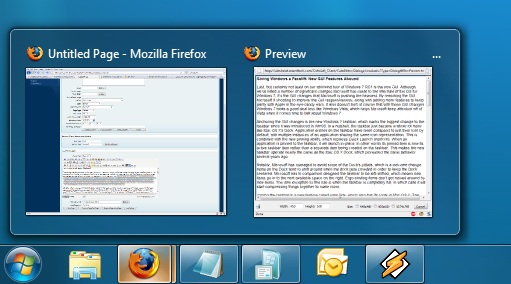
Handling multiple instances of a single app
Notably, Microsoft has managed to avoid some of the Dock’s pitfalls, which is a welcome change. Items on the Dock tend to shift around when the dock gets crowded in order to keep the Dock centered. Microsoft in comparison has designed the taskbar to be left-shifted, which means new items go into the next available space on the right. Ergo existing items don’t get moved around by new items. The only exception to this rule is when the taskbar is completely full, in which case it will start compressing things together to make room.
Joining the taskbar is a new feature called jump lists, which also has its roots in Mac OS X. The jump list replaces the normal right-click menu that comes up when clicking on an item in the taskbar, and is based around the concept of the jump list containing custom controls for an application, alongside the generic window manipulation options. A screenshot works better than words here, so let’s start with that.
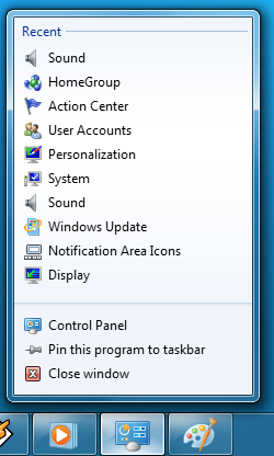
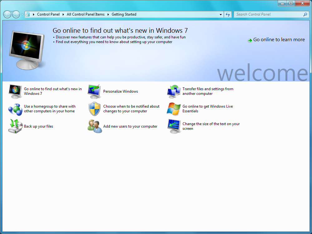
The Control Panel Jump List
As an application needs to be coded to take advantage of jump lists, any advanced functionality that moves beyond window manipulation is limited at this point to the handful of Microsoft applications implementing jump list support. The most common use for jump lists will be showing recently used items for a specific application, which in turn is intended to replace the Recent Items collection in the Start Menu (it’s still there but it’s disabled by default). Thus far a couple of applications, most notably Windows Media Player, have implemented further jump list functionality, also serving proof of concept implementation for 3rd party developers. The WMP jump list includes music controls while the Getting Started control panel lists all of its component items as tasks.
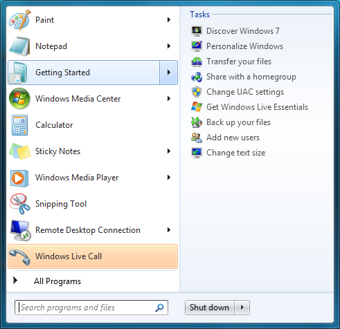
Jump lists also show up in the Start Menu, where recent applications with jump list support will have those lists available as a sub-menu attached to the application. The boys (and girls) at Microsoft seem rather proud of jump lists, but their success is largely out of Microsoft’s hands. For jump lists to be successful in the long run, developers need to start using them such that a critical mass is reached and jump list use becomes a standard feature. In spite of having similar functionality in Mac OS X, Apple has never pushed the issue and as such few programs use their implementation and few people even know it exists.
Jump Lists in the Start Menu
Also new are two window management features, Aero Snap and Aero Shake. Neither of these are Exposé clones (come on guys, you could take the dock but not Exposé?) so we’ll get that out of the way right now. With Aero Snap, Windows now recognizes when windows are being dragged to the edge of the screen, and treats that as a special action (not unlike Mac OS X’s hot corners). When a window is dragged to the top of the screen it’s maximized, and when a window is dragged to the left or the right it’s enlarged/tiled in such a way that it takes up the half of the screen it was dragged to. Pulling a window away from the side of the screen that it was dragged to reverts the window back to the way it previously was.
Snapped to the right
Meanwhile Aero Shake is the more oddball of the new window management features. When you shake a window (I’m being serious here) it causes all other application windows to become minimized. Shake the window again, and everything is restored. To Microsoft’s credit we're not immediately aware of any exact analog to this features (perhaps Mac OS X’s Hide All?) so it’s certainly unique. Whether it’s useful however….
It should be noted that while both of these features have “Aero” in the name, they’re not actually tied to Aero and the DWM. They work just as well with the Basic GUI, albeit without the eye-candy animations.
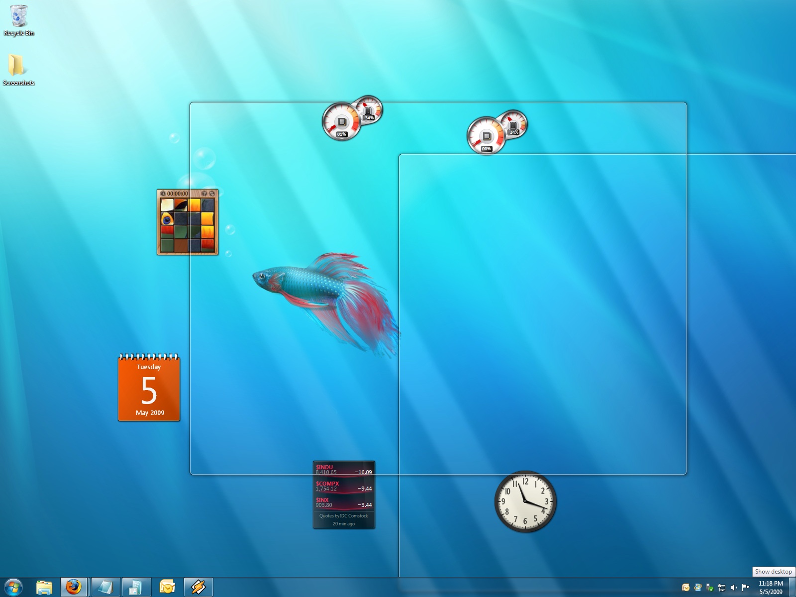
Gadgets have been relocated as of Windows 7. They’re no longer constrained to the Windows Sidebar (which has gone away completely) and can now be placed anywhere on the desktop, similar to how Yahoo! Widgets operates. As the Sidebar always felt out of place in Vista, this is a nice change to how gadgets are dealt with on Windows. With the removal of the Sidebar the internal workings of the gadget feature have also been tweaked – gadgets no longer get their own process and instead share a single process. This helps Microsoft in achieving their goal to bring down Windows’ memory usage, but it means that a rogue gadget can bring down the rest. Meanwhile gadget-haters will be glad to know that with the Sidebar gone, and the OS no longer loads the gadget process (which is still called sidebar) by default. The process is only fired up when a gadget is attached to the desktop, saving yet more memory and shaving a few seconds off of the Windows boot time.
With the change in gadget functionality, one last new feature has been added to the taskbar (and as a keyboard shortcut) to make it easier to access the gadgets. Aero Peek, as Microsoft calls it, is a small button on the right of the taskbar that makes all application windows transparent when hovered over, allowing users to see (i.e. peek at) the gadgets on their desktop without actually messing with any application windows. Clicking the button then minimizes all application windows so that users are free to interact with the gadgets (or anything else on the desktop for that matter), and clicking it again restores the application windows.
Using Aero Peek To Look At the Gadgets
This specific feature makes interacting with the gadgets much more like Mac OS X’s Dashboard, which is a separate space where only Mac OS X widgets reside. There’s a big difference in keeping gadgets/widgets on the desktop versus in a separate dashboard, but with the addition of Aero Peek the absolute functionality becomes quite similar. The desktop in this case is Windows’ dashboard.
As for the Start Menu, it has not seen any big changes for Windows 7, but it has seen some minor functionality reduction. For those hold-outs still using the classic Start Menu, it has finally been removed with Windows 7. The modern Start Menu is now the only option.
Finally, the overall theme of the GUI has been changed for Windows 7. Gone is the pea green highlighting and artwork found in various Explorer and Control Panel panes, to be replaced with a more neutral blue/grey styling reminiscent of Apple’s metal themes. If something was green by default in Vista, it’s blue by default in Windows 7. Most of the color choices in Windows 7 can be adjusted through themes just like it could with Vista, although like Vista some items are static images and as such Windows 7 always retains some of its blue styling.
The new Welcome Screen, an example of the Windows 7 GUI style
The ribbon interface from Microsoft Office has also made its way over to Windows 7, showing up in a handful of applications. Paint and WordPad are the most prominent examples of this change, as the use of ribbons required a facelift for each. The ribbon has been pretty popular with users once they become accustomed to it, so it’s likely that Microsoft will continue to slowly deploy it in more applications as time goes on. Presumably it will become the dominant interface in Windows at some point in the future.
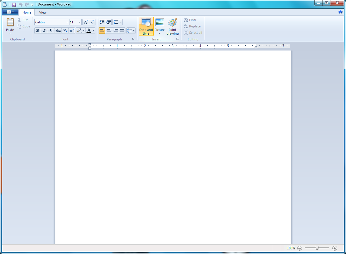
WordPad gets its ribbons


121 Comments
View All Comments
strikeback03 - Thursday, May 7, 2009 - link
In some things I can understand moving stuff, but there are also some that were moved for no good reason. For example, in XP to get display properties, you right click the desktop and click properties. In Vista there is at least one additional page to click through to get that. Ultimately, it seems to me that MS tries too hard to hide the settings, likely to protect the users who don't know what they are doing, but a pain for the users who do. For the record, I had the same complaint about XP coming from win2000, that whenever you hop on a system that wasn't set to all the classic settings, it is a pain to get around.Jackattak - Thursday, May 7, 2009 - link
But Strikeback you're talking about probably 10% of the users (power users). The majority of Windows users don't give a crap about modification, and that's who they're "protecting" based on your explanation.If you were running Microsoft, wouldn't you find it a small issue that you were "inconveniencing" 10% of your user base by making them go "one page deeper" in order to "protect" 90% of your users?
strikeback03 - Friday, May 8, 2009 - link
Then do like the GPU companies do and have both simple and advanced versions of the interface. Allow them to change one setting to show or hide all the "advanced" stuff across the OS. And put it somewhere easy to find, like the start menu.mathew7 - Wednesday, May 6, 2009 - link
I'm also a XP-lover. Even in XP I'm using it with classic view (2K view).My main problem is removal of old start-menu (cascading menus). I really hate the Vista style-menu.
Also, I prefer UAC disabled and using run-as different user. Unfortunately (in Beta), explorer would not take the new permissions (launch in separate process was enabled for both users), which means configurations had to be done with admin logon. I have not tried this yet in RC. Also, once UAC was disabled, the UAC menu items (with the shield) were still present with no actions (again I don't know about RC).
On the other hand, the new taskbar (with previews) and the multimedia settings are good-enough reason for me to switch.
ssj4Gogeta - Wednesday, May 6, 2009 - link
Start menu is one of the best features that were introduced in Vista. It's great on a netbook or a small monitor. You also don't need to move your mouse, just type in the first few letters of the app name. It also searches your documents for you.And about that RAM issue, what did you expect? I'm surprised it even runs on 512MB. Even netbooks have at least a gig of RAM.
SirKronan - Wednesday, May 6, 2009 - link
I like the revamped start menu as well. Love instant search!But did they add Blu-ray support to Media Center? This has been one of my complaints from the beginning about Media Center. It has to launch a separate program to play Blu-rays & HD DVD's, and I haven't found any way around it short of ripping the movies to a hard disk. I realize there are anti-trust/competitive laws, and I honestly don't mind having to buy PowerDVD or WinDVD to get their decoder, but I want the movie to play back in MEDIA CENTER with all of the interface's great features, like the smooth playback and intuitive controls, guide information, zoom feature (get rid of black letterbox - with 1080p you certainly have enough resolution to scale a tad!), etc.
Have they added that yet? If not, PLEASE, Anand, ask them to for us!
KingViper - Wednesday, May 6, 2009 - link
Archsoft and the newest version of PowerDVD both have plugins for Media Center..from what I hear. Although Media Center itself isn't actually playing the Blu-Ray..it looks like it integrates well. You might try out the trial versions.chrnochime - Wednesday, May 6, 2009 - link
Just because netbooks have more ram(and not every one of them has 1G, some has 512MB), doesn't mean the OS should try to gobble up as much as is available. I don't get why every iteration of their OS just keep getting bigger and bigger, with little discernible improvements to the average user.and this? "Ultimately, with Microsoft throwing Windows 7 RC1 out to the masses, we can't think of a good reason not to try it."
Unless they have ways to export the settings in programs and whatever document users have when they were using W7, it'd be really hard to convince the average user to try out just for sake of novelty.
KingViper - Wednesday, May 6, 2009 - link
"I don't get why every iteration of their OS just keep getting bigger and bigger, with little discernible improvements to the average user. "Many things an OS is responsible for is not necessarily obvious to the average user. Compatibility with almost all hardware available, including keeping the OS as secure as possible. DX10\DX11 and h264 codecs etc. etc. etc. TONS of stuff is added, but it isn't necessarily used everyday. Of course it's going to get bigger.
I don't understand how XP users are about as bitter with Microsoft as Mac users are. Can you just not afford a Mac or what?
mathew7 - Wednesday, May 6, 2009 - link
I also would like to say about W7RC and low-RAM:Windows 7 on 512MB RAM (desktop Intel G45 MB w/laptop HDD) feels to me like XP din on a 64MB RAM laptop years ago. It's good for internet/light work, but even for that you need patience because of swapping.